
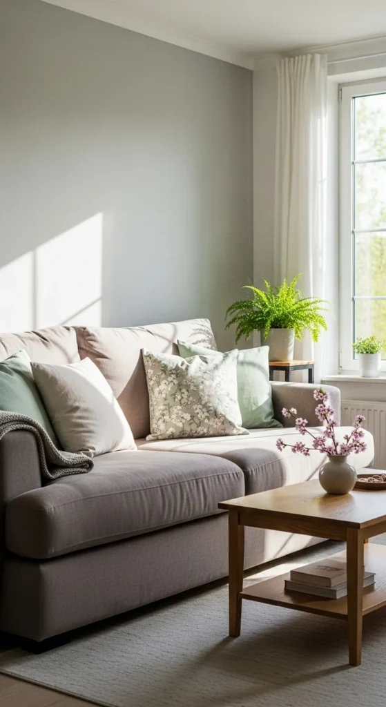
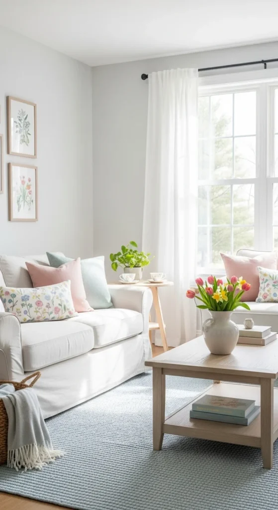
Soft-color decor works beautifully in spring because it creates calm without feeling flat. Gentle tones like blush, sage, buttercream, and muted blue reflect light while keeping rooms relaxed and welcoming. These ideas focus on small swaps, low-cost updates, and realistic DIY styling that fit everyday homes. You don’t need bold color or major changes to make a space feel lighter and more comfortable. Thoughtful layering and restraint do most of the work.
1. Blush Linen Throw Pillows
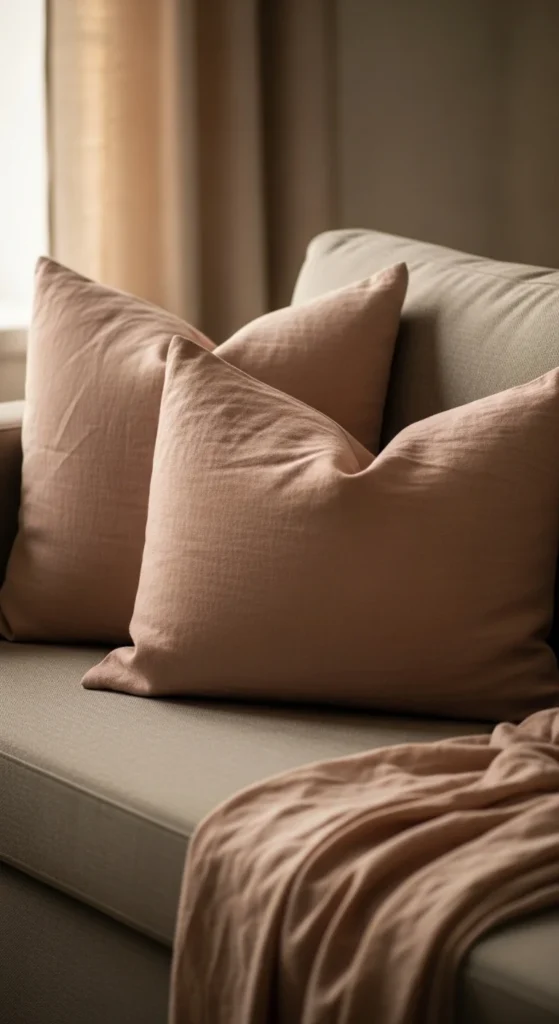
Blush pillows add softness without pulling focus. Linen keeps the color grounded and natural rather than sweet. Two or three pillows are enough for most sofas.
Look for removable covers to save money. You can store darker covers for later seasons. If sewing is an option, linen napkins or fabric remnants work well for simple envelope covers.
Pair blush with cream or light gray so the color stays gentle. Avoid mixing too many tones. Texture creates interest while color stays quiet.
2. Pale Sage Accent Chairs
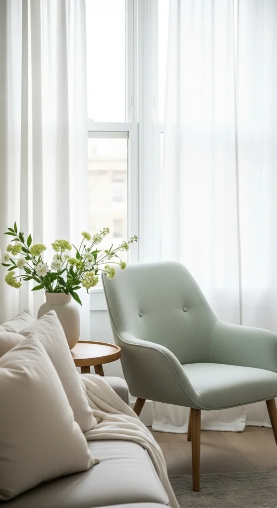
Pale sage works well as a single accent. It pairs easily with neutrals and wood tones. Upholstered chairs in this shade feel calm and lived-in.
Shop secondhand for solid frames. Reupholster using affordable fabric or slipcovers. Place the chair near a window to highlight natural light.
Keep nearby decor simple. One pillow or a light throw is enough.
3. Soft Blue Ceramic Vases
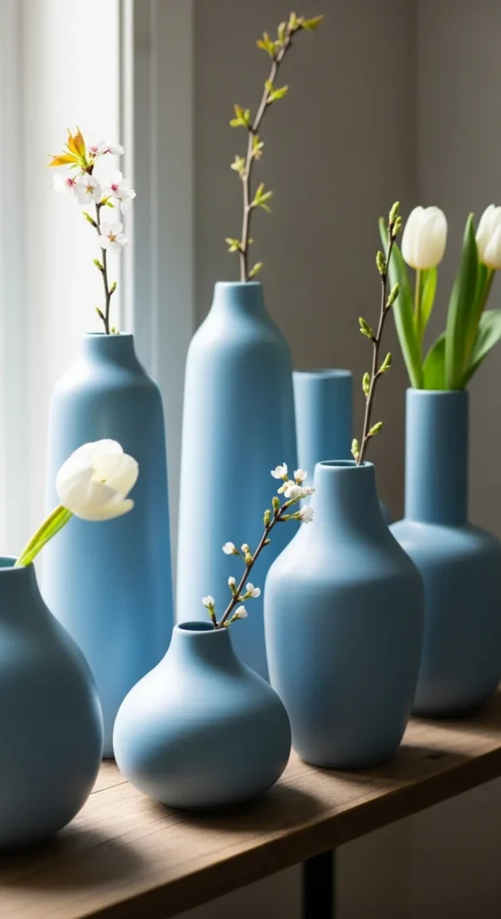
Muted blue ceramics bring subtle color without noise. They work well on shelves, tables, or mantels.
Thrift stores often carry ceramics in soft shades. Group vases in odd numbers and vary height slightly.
Leave some vases empty. This keeps the setup calm and uncluttered.
4. Buttercream Area Rugs
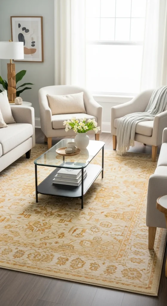
Buttercream rugs warm up rooms without dark contrast. Flatweave styles are practical and easy to maintain.
Layer a smaller rug over an existing one to save money. Subtle texture hides wear while keeping the tone light.
Vacuum regularly to maintain brightness.
5. Lavender Table Linens
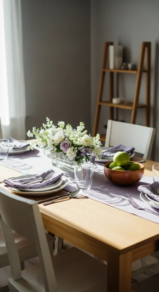
Lavender adds calm color in small doses. Table runners or napkins work well.
Use cotton or linen fabrics. DIY runners can be made from fabric yardage with simple hems.
Keep surrounding decor neutral so the color feels balanced.
6. Muted Peach Wall Art
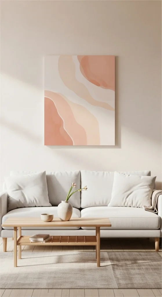
Soft peach artwork adds warmth without overpowering walls. Abstract prints or watercolor styles work best.
Use simple frames in white or light wood. Hang at eye level with space around each piece.
Limit to one or two artworks per wall.
7. Powder Blue Throw Blankets
Light blue throws soften seating areas. Cotton or lightweight knits work well.
Fold neatly or drape casually over an armrest. Avoid heavy textures.
One throw per seating area is enough.
8. Soft Yellow Floral Accents
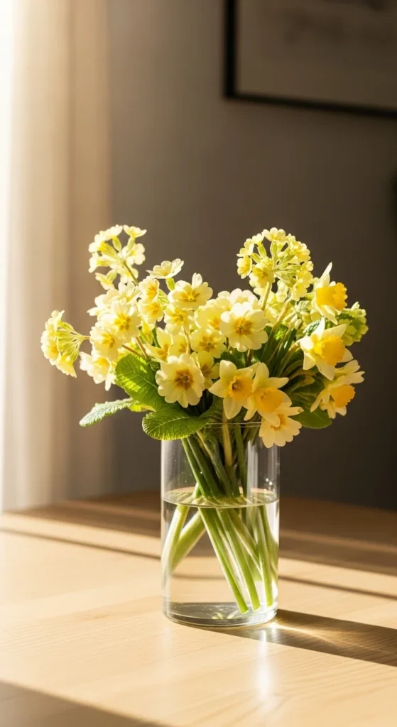
Soft yellow flowers bring warmth without brightness. Choose simple arrangements.
Use grocery-store flowers or garden clippings. Trim stems short for a relaxed look.
Keep vases neutral so flowers stand out gently.
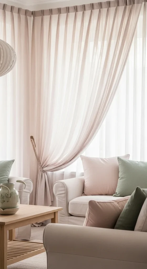
9. Pale Gray Curtains
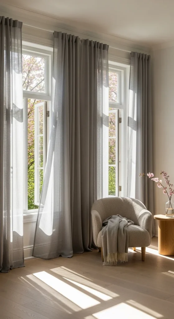
Pale gray curtains soften windows while allowing light to pass through. Linen or cotton fabrics work best.
Hang curtains higher than the window frame for height. Affordable panels can look custom with basic hemming.
Avoid dark rods or hardware.
10. Soft Pink Ceramic Lamps
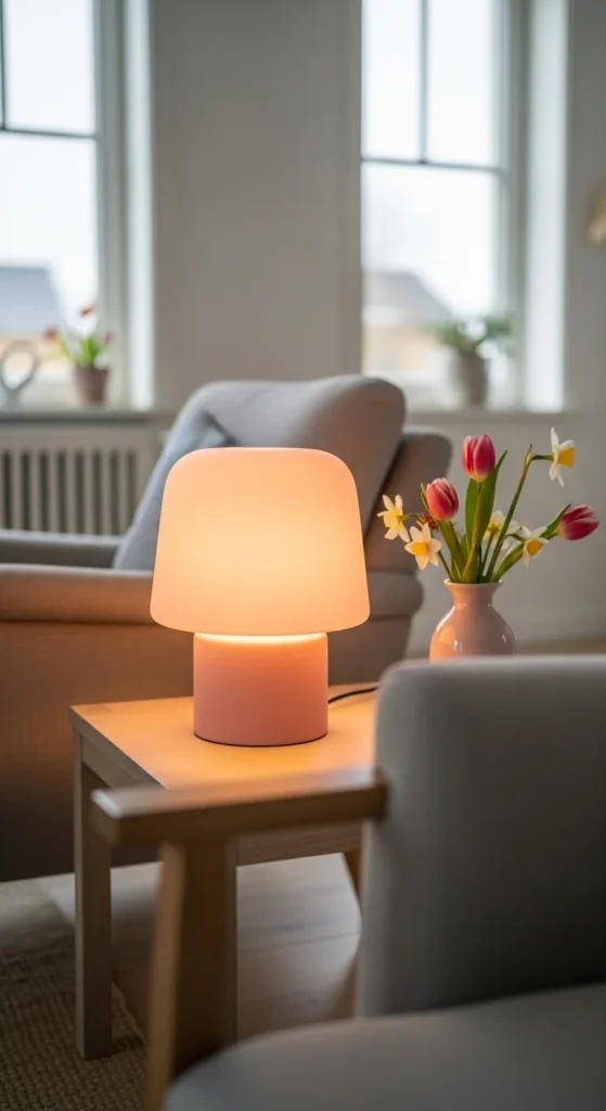
Soft pink lamps add subtle color through shape rather than fabric. Ceramic bases feel grounded.
Use white or cream shades to keep lighting calm. Swap lampshades seasonally instead of replacing lamps.
Place lamps near seating for balance.
11. Muted Green Plant Pots
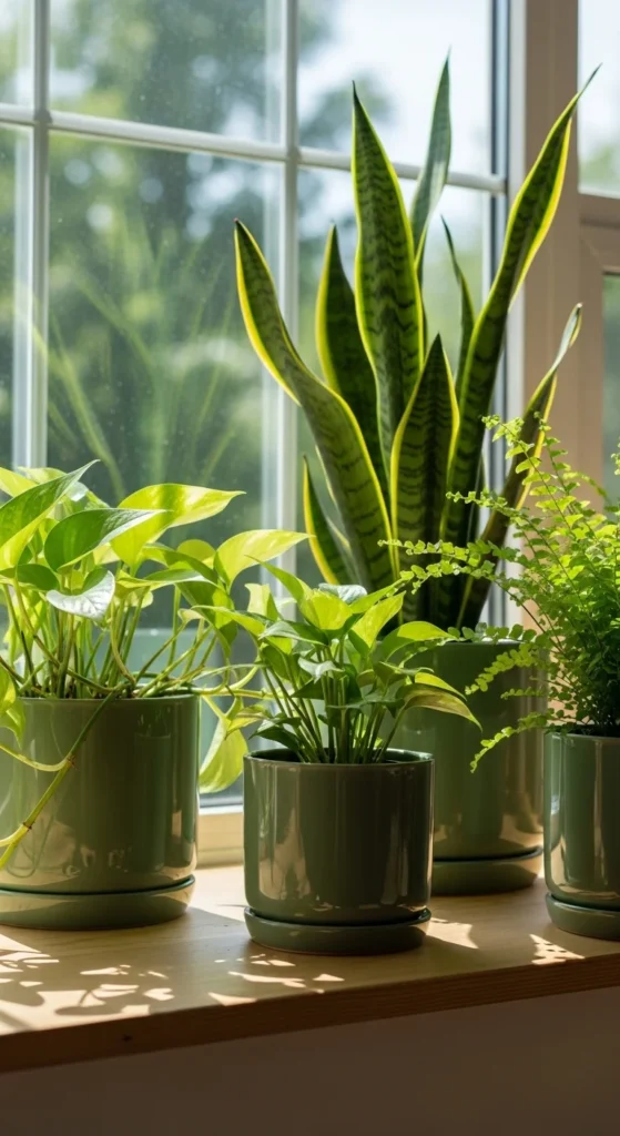
Muted green pots echo foliage without competing with it. Ceramic or clay works well.
Use the same color family for cohesion. This keeps plant displays tidy.
Affordable pots can be painted using matte paint.
12. Soft Taupe Furniture Covers
Taupe covers add warmth while staying neutral. Slipcovers are practical and washable.
Choose slightly oversized covers and tuck fabric neatly. This creates a relaxed look.
Pair with lighter pillows for contrast.
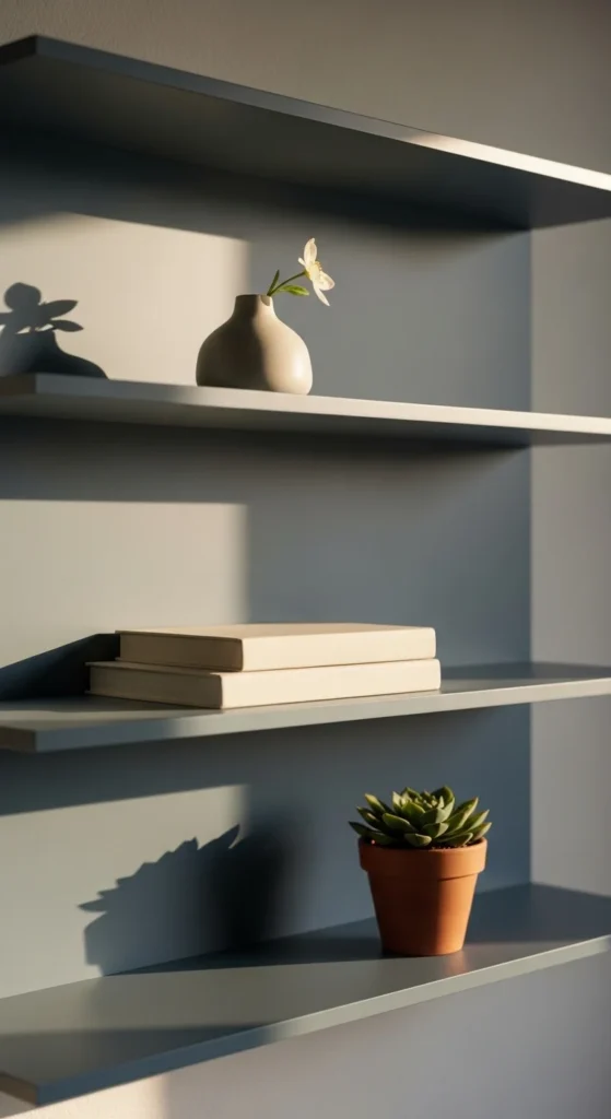
13. Pale Mint Shelf Decor
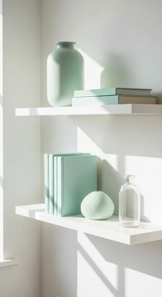
Mint works best in small amounts. Use decor objects rather than large furniture.
Ceramics, books, or small frames add just enough color. Leave space between items.
Avoid overcrowding shelves.
14. Soft Beige Woven Baskets
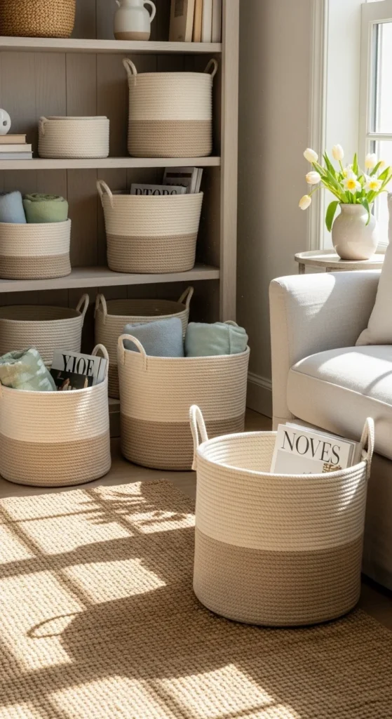
Beige baskets offer texture without visual weight. Use them for blankets or magazines.
Natural fibers pair well with soft colors. Place baskets near seating areas.
They replace bulky storage easily.
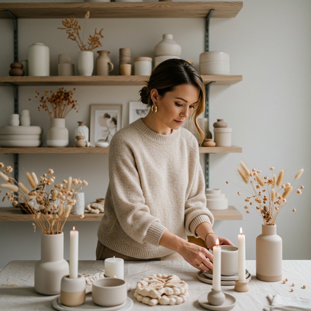
15. Pastel Candle Holders
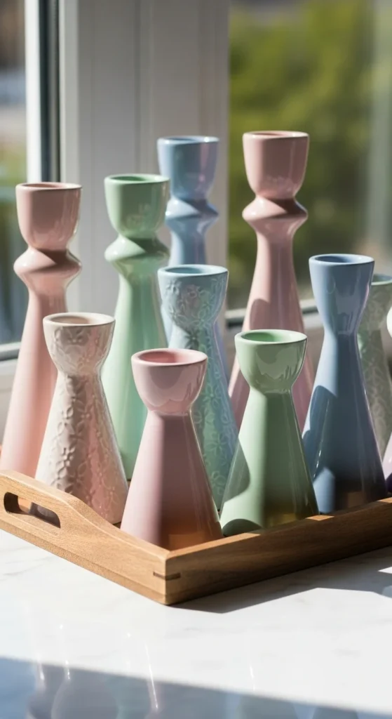
Pastel candle holders add color in controlled doses. Stick to one color family.
Group two or three holders together. Use neutral candles to keep balance.
They work well on tables and shelves.
16. Light Blue Bedside Tables
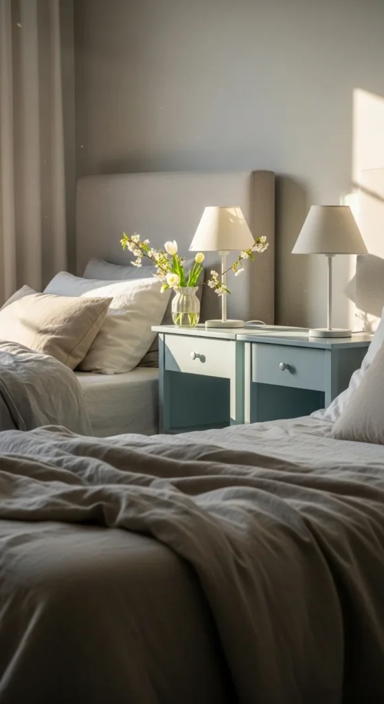
Light blue tables feel calm and welcoming. Simple shapes work best.
Paint existing tables instead of buying new ones. Matte finishes keep color gentle.
Style tops minimally.
17. Soft Rose Wall Mirrors
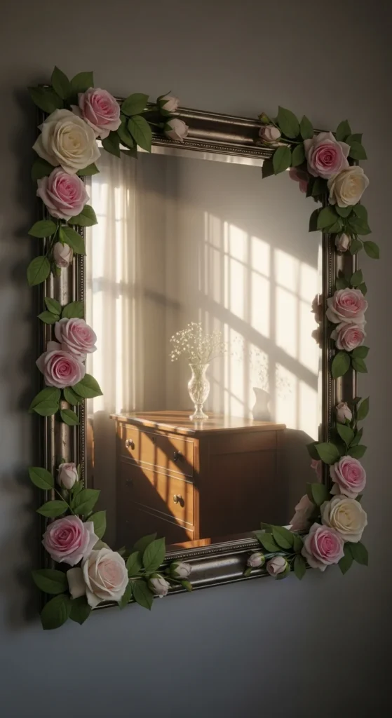
Rose-toned frames add warmth without shine. Choose thin frames.
Hang mirrors where they catch daylight. Keep surrounding decor simple.
This adds light and subtle color together.
18. Muted Coral Cushions
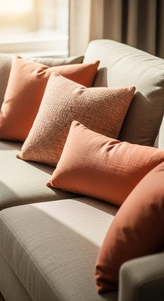
Muted coral works best in small accents. Cushions are an easy option.
Pair coral with cream or taupe. Avoid pairing with bold patterns.
Limit to one or two cushions.
19. Soft Color Entryway Rugs
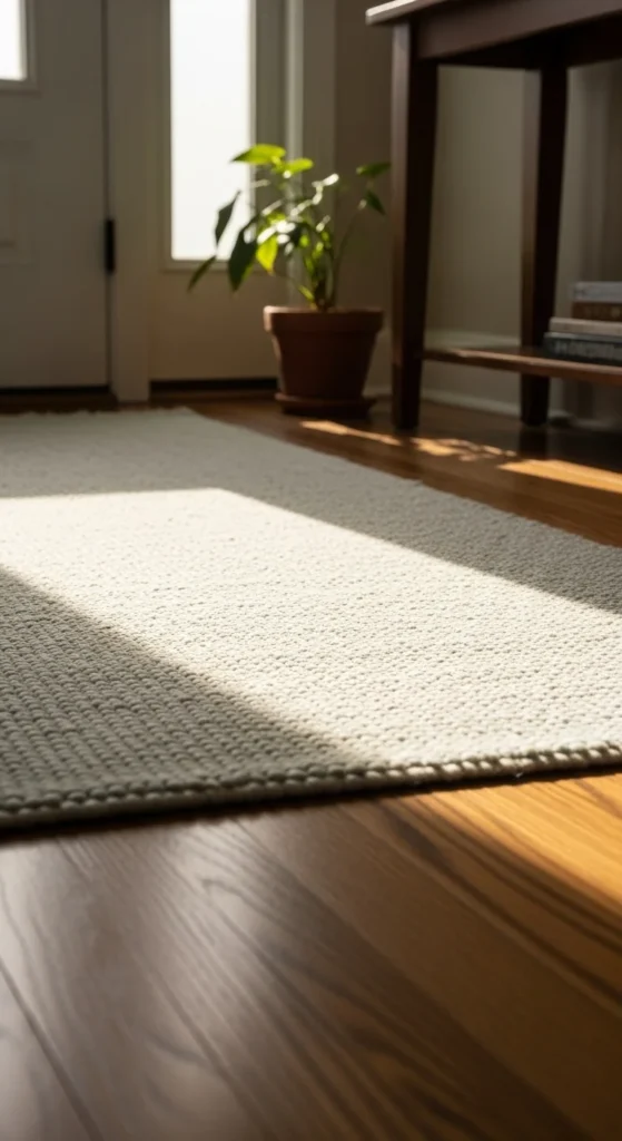
Entryway rugs in gentle tones welcome guests calmly. Low-pile rugs are practical.
Choose subtle patterns to hide wear. Shake out rugs often to maintain color.
This small change sets the tone for the home.
20. Pale Lilac Desk Accessories
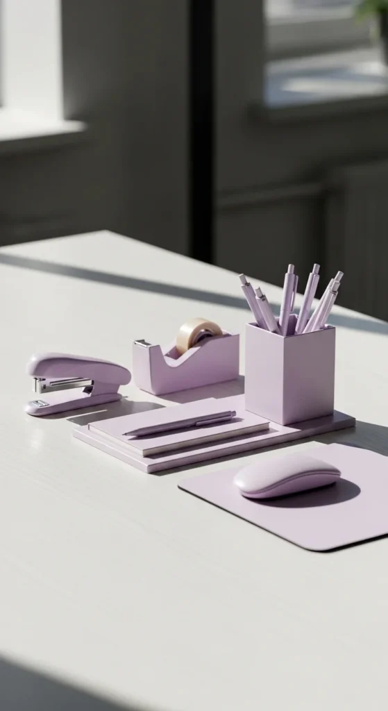
Lilac works well in workspaces when used sparingly. Pen holders and trays are enough.
Avoid filling the desk surface. Space supports focus.
This adds personality without distraction.
21. Soft Yellow Kitchen Towels
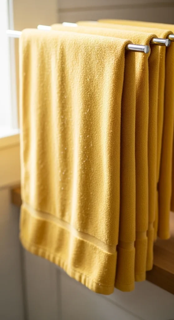
Soft yellow towels brighten kitchens gently. Cotton towels are easy to rotate.
Store darker towels away for spring. This change costs little but feels thoughtful.
Pair with neutral counters.
22. Muted Blue Wall Shelves
Soft blue shelves add color through structure. Keep decor minimal.
Paint existing shelves instead of replacing them. Use matte paint.
This adds interest without clutter.
23. Pale Peach Curtains
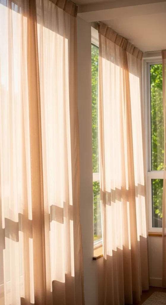
Peach curtains add warmth while allowing light through. Sheer fabrics work best.
Hang high and wide for openness. Pair with neutral walls.
Avoid heavy hardware.
24. Soft Color Door Accents

Small accents like painted trim or hardware add interest. Keep tones muted.
Test paint samples first. This avoids bold contrast.
Limit accents to one area.
25. Consistent Soft Color Palette
Using a limited palette keeps rooms calm. Choose two or three soft tones.
Repeat them across pillows, art, and small decor. This creates harmony without effort.
Consistency matters more than quantity.
Conclusion
Soft-color spring decor works best when changes stay small and intentional. By focusing on gentle tones, light textures, and simple swaps, spaces feel calmer and more comfortable without major updates. Start with one accent, build slowly, and allow natural light to guide the overall feel of each room.
Leave a Reply