
Spring is the season when many people feel the urge to reset their spaces. Lighter colors, natural textures, and simple styling choices can help rooms feel calm and put-together without expensive changes. Balanced interior decor is about mixing softness with structure, comfort with function, and personality with restraint. The ideas below focus on small, affordable updates that create harmony throughout your home while keeping things practical and easy to maintain.
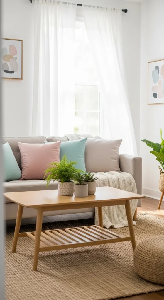
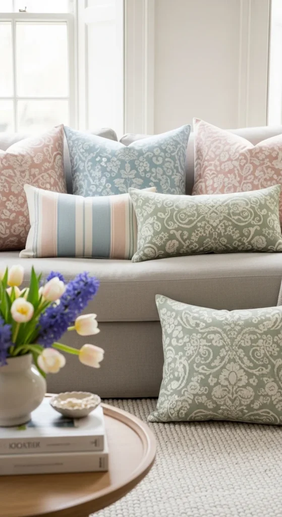
1. Soft Neutral Sofa Layering
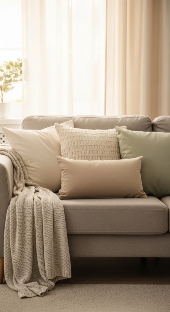
Layering a sofa with soft neutrals creates a calm base that works all year. Start with two or three pillows in similar tones, then add one with a gentle pattern for interest. Keep the colors within the same family to avoid visual clutter.
Affordable pillow covers can instantly change the look. Look for cotton or linen blends that feel light and breathable. If you already own inserts, simply swap the covers.
Drape a lightweight throw over one arm or across the back. This adds texture and makes the seating feel inviting. Stick to simple knits or thin woven blankets.
The result feels cozy but not heavy. This approach works in living rooms, family rooms, and even bedrooms with seating. Neutral layering builds a relaxed foundation that makes it easy to add seasonal accents later.
2. Light Wood Coffee Table Styling
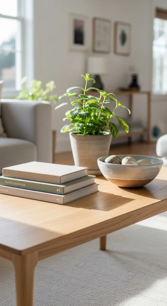
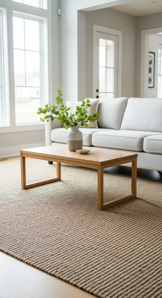
A light wood coffee table naturally suits spring decor. Keep styling minimal to maintain balance. Start with one small stack of books or magazines as a base.
Add a simple ceramic bowl or tray. This gives you a place for remotes or small items without mess. Finish with a small plant or vase for a touch of life.
Avoid overcrowding the surface. Negative space helps the room feel calm. If your table has shelves, use baskets to hide clutter.
Light wood pairs well with white, beige, and soft gray. It also works with muted pastels. Simple table styling keeps the room grounded and functional.
3. Airy Sheer Curtains
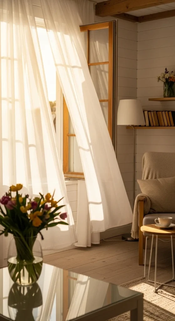
Sheer curtains instantly make a room feel lighter. They filter sunlight without blocking it, creating a soft glow.
Choose white, ivory, or very pale gray. These shades blend easily with most palettes. Hang curtains higher than the window frame to give the illusion of height.
Budget-friendly panels are widely available. Look for simple rod-pocket or grommet styles for easy installation.
Sheers work well alone or layered with heavier curtains. In spring, using only sheers keeps the space open and breezy. Light-filtering fabric creates a calm atmosphere that supports a balanced look.
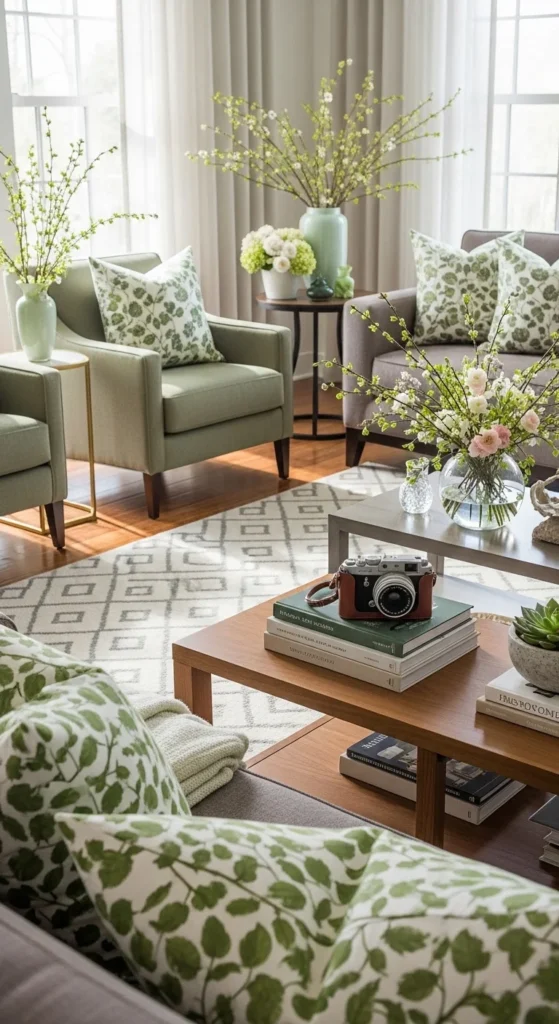
4. Potted Greenery in Groups
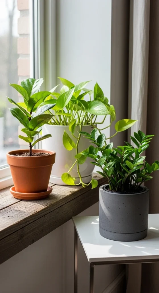
Plants bring life to any space. Grouping them in threes or fives looks more natural than placing single plants everywhere.
Use a mix of heights and leaf shapes. Combine one taller plant with two smaller ones. Keep pots simple and similar in tone.
If real plants feel like too much work, try low-maintenance options like pothos or snake plants. Faux plants also work if they look realistic.
Place groups near windows, on shelves, or beside seating areas. Greenery softens hard edges and adds visual balance.
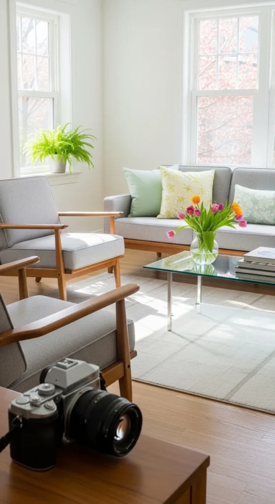
5. Pastel Accent Pillows
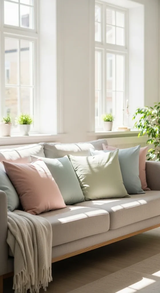
Pastel pillows introduce gentle color without overwhelming the room. Choose one or two shades and repeat them elsewhere for cohesion.
Mix solid colors with subtle patterns. Avoid bold prints that dominate the space.
Swapping pillow covers is one of the easiest updates. Store off-season covers in a bin for future use.
Pastels pair nicely with neutrals and light wood. Small pops of color keep the space lively yet calm.
6. Neutral Area Rug Base
A neutral rug anchors furniture and ties elements together. Look for beige, cream, or light gray tones with subtle texture.
Flatweave or low-pile rugs work well for spring. They feel lighter and are easier to clean.
If you already own a darker rug, layering a smaller neutral rug on top can soften the look.
A simple rug allows other decor to shine. Grounding the room with a neutral base supports visual harmony.
7. Minimal Wall Art Sets
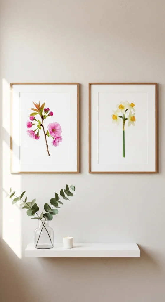
Choose two or three pieces that share a theme or color palette. Botanical prints, soft landscapes, or abstract neutrals work well.
Hang art at eye level and space evenly. Consistency matters more than size.
Budget prints can be framed in matching frames for a cohesive look. Thrift stores often have affordable frames.
Minimal art keeps walls from feeling empty without overcrowding. Simple groupings create order and balance.
8. Light-Colored Throw Blankets
Switch out dark winter throws for lighter shades. Cotton or thin knits feel appropriate for warmer months.
Fold neatly or drape casually. Avoid stacking multiple blankets.
Choose colors that match your pillow palette. This keeps the look intentional.
Light textiles add comfort without heaviness.
9. Open Shelf Styling with Space
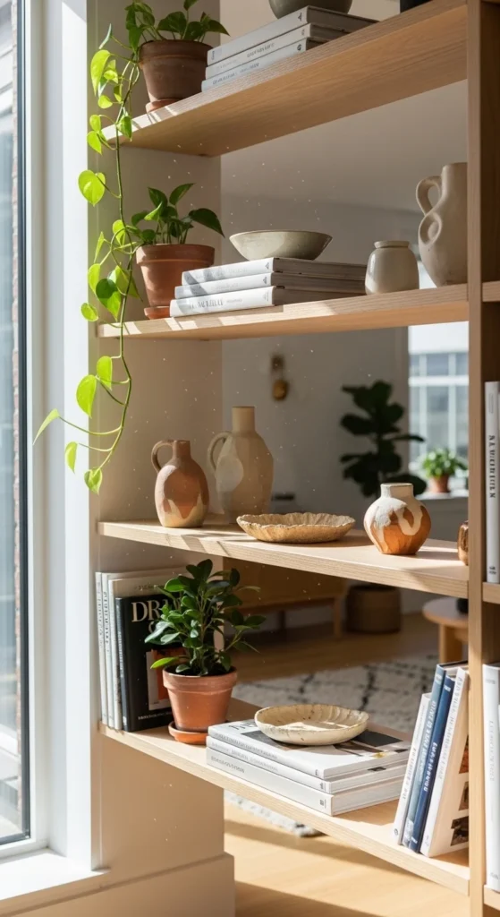
Open shelves look best when not overfilled. Use a mix of functional and decorative items.
Leave breathing room between objects. Group items in odd numbers.
Stick to a limited color palette. White, beige, and wood tones work well.
Negative space keeps shelves calm and organized.
10. Soft Table Lamp Glow
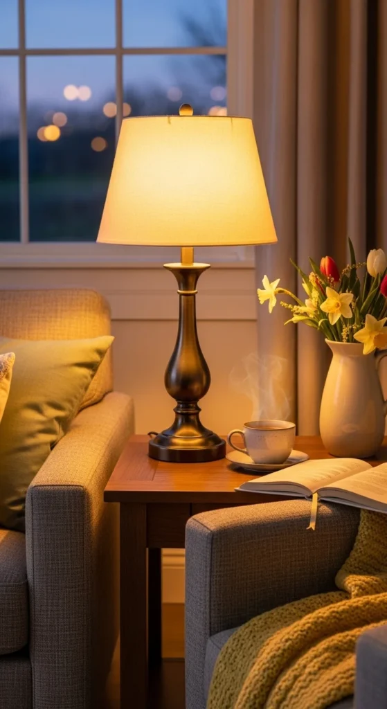
Choose lamps with simple bases and light-colored shades. Warm bulbs create a cozy feel.
Place lamps near seating areas and beds. This adds layered lighting.
Secondhand lamps can be updated with new shades. Soft lighting supports relaxed balance.
11. Simple Entryway Tray
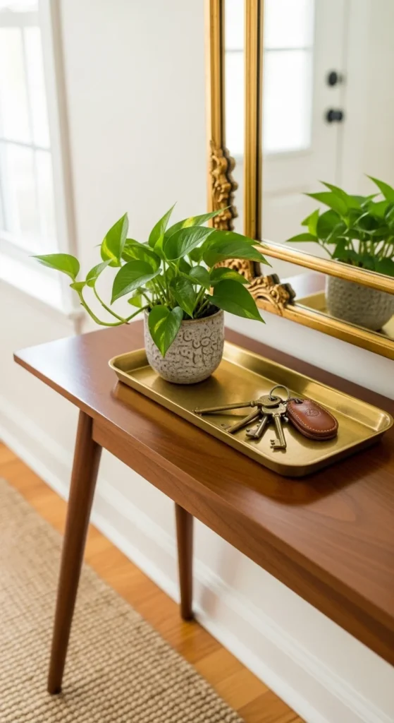
Use a tray to catch small items. Add one decorative object.
Keep the surface mostly clear. This sets the tone for the home.
Functional simplicity feels orderly.
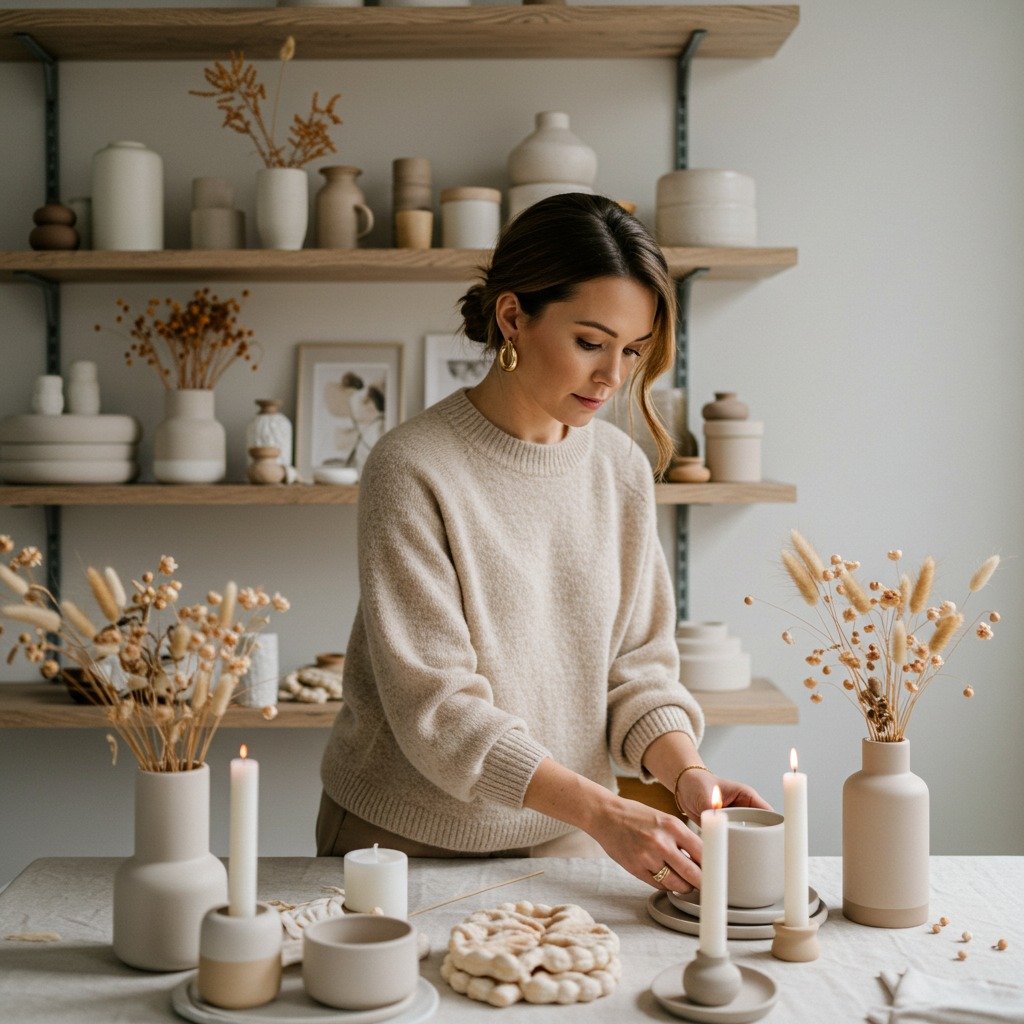
12. Coordinated Candle Grouping
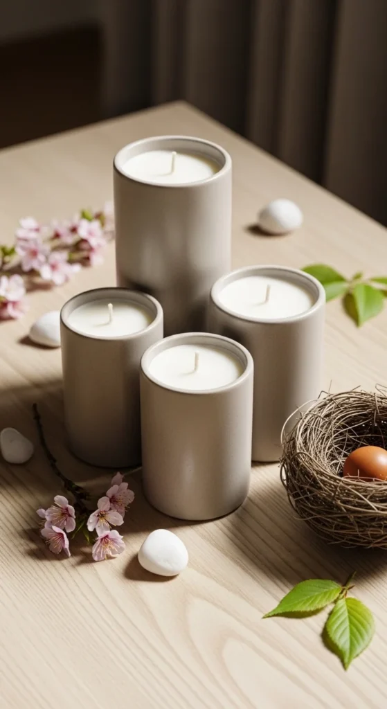
Group candles in similar colors but varied heights.
Unscented or light scents work best.
Repeating shapes adds visual rhythm.
13. Light Wood Dining Chairs
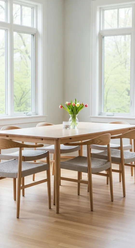
Light wood feels airy and casual.
Mix with neutral cushions.
Natural materials create calm.
14. Simple Bedside Styling
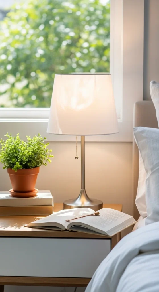
Limit items to three.
Keep colors soft.
Less clutter equals better rest.
15. Woven Baskets for Storage
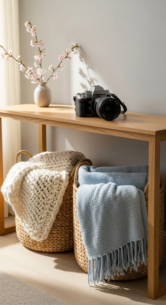
Use baskets to hide items.
Natural fibers add texture.
Hidden storage keeps balance.
16. Soft Accent Chair Corner
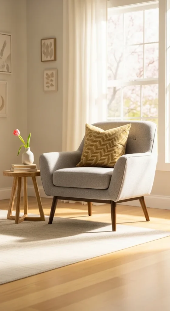
Create a small reading spot.
Keep colors neutral.
Small zones make rooms feel complete.
17. Neutral Bathroom Towels
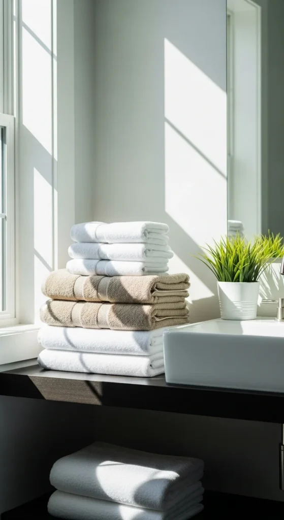
Swap bright colors for soft neutrals.
Roll or fold neatly.
Calm tones suit bathrooms.
18. Simple Floral Arrangement
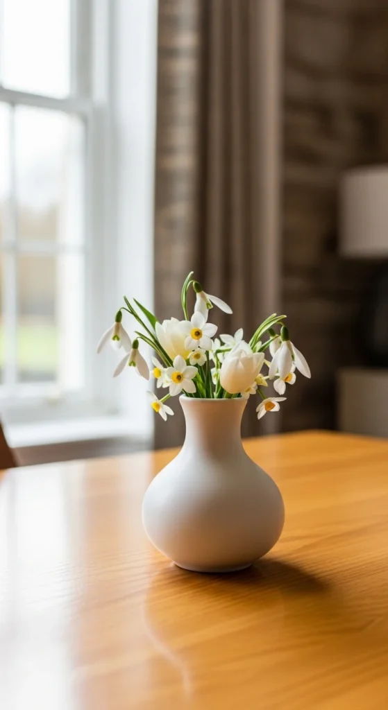
One small arrangement is enough.
Use grocery store flowers.
Natural touch adds charm.
19. Balanced Color Repetition
Repeat one accent color in a few places.
Avoid too many shades.
Consistency creates flow.
20. Clean Line Furniture
Choose simple silhouettes.
Avoid bulky shapes.
Streamlined furniture feels lighter.
21. Soft Pattern Mix
Mix two patterns max.
Keep colors similar.
Subtle contrast adds interest.
22. Neutral Wall Paint Touch-Up
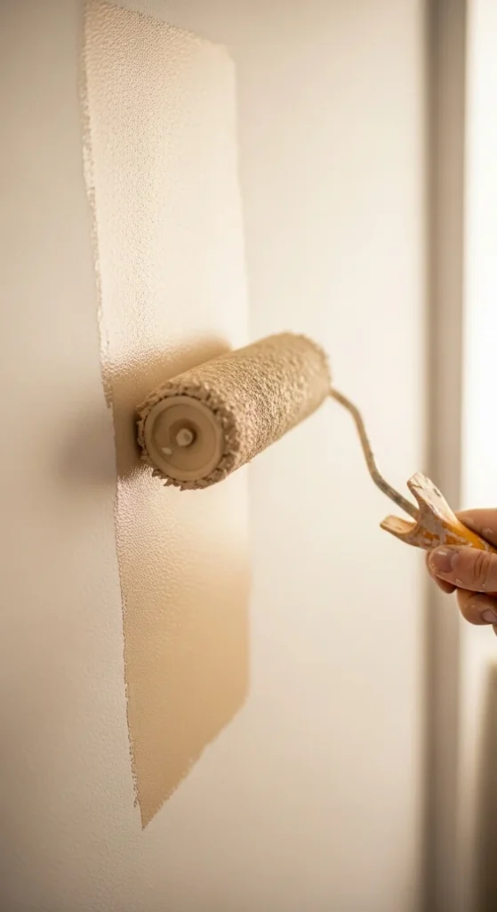
Patch scuffs.
Use sample pots.
Clean walls change everything.
23. Light Spring Table Runner
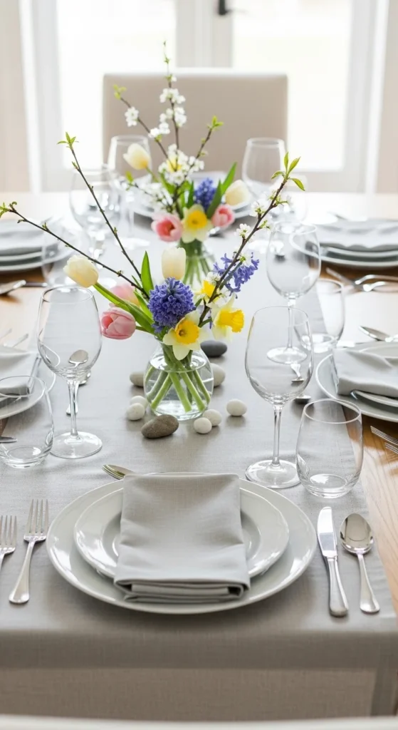
Choose linen or cotton.
Soft colors work best.
Small textile updates feel seasonal.
24. Minimal Mantel Decor
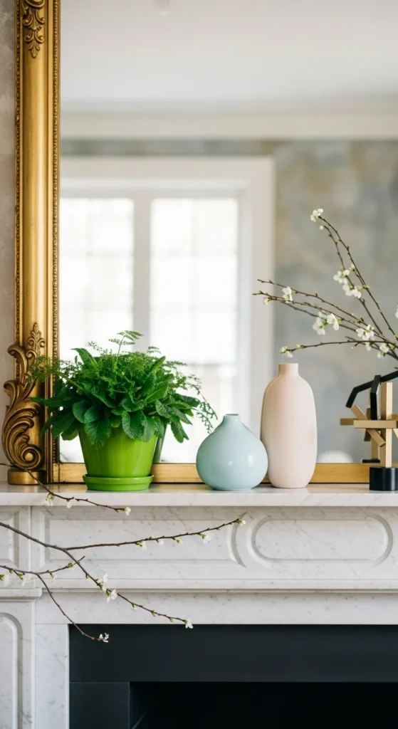
Stick to three items.
Vary height.
Less feels intentional.
Conclusion
Balanced spring decor comes from thoughtful choices, not big spending. By focusing on light colors, natural textures, and simple groupings, any room can feel calmer and more put-together. Try one or two ideas at a time and notice how small shifts change the mood of your space. These practical updates make it easy to enjoy a home that feels easygoing, comfortable, and ready for the season.
Leave a Reply